
Changes are good.... Right?
First off... If you have been browsing the site this morning you would have seen some new changes ongoing right before your eyes. I'm playing around mainly with the Downloads section and the way files are presented. If you see anything strange happening... Ignore it for now.
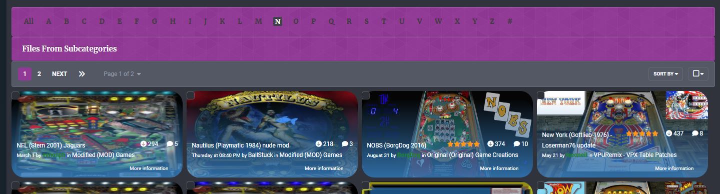
To Sub-Categorize Or Not to Sub-Categorize? That is the Question.
I'm debating on removing most of the sub-categories from the downloads section. For example move all VPX tables into the VPX section instead of breaking them down by design type, DMD, EM, etc. In doing this it will lump all games into a single category. I'll probably keep VPURemix, Pup-Pack Originals, Originals, and MODS in their own sub-categories. With this change in mind, I've added the ability to filter files by the first letter of the title. This way you can quickly jump to a specific game that you are looking for.
Changes to File View:
The first major change is to the File View and the way the file is displayed. Some changes already done include moving the "like" button back to the top near the download button. I am still working on this new view to streamline things, so expect changes to this layout as it evolves.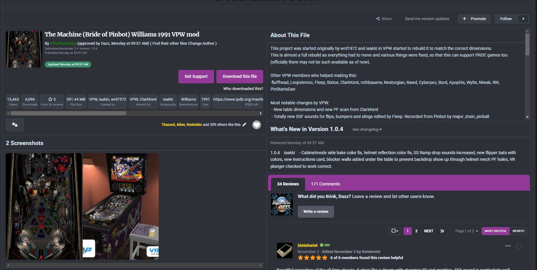
Beer Me currently not working in the new File View:
"Beer Me" is NOT currently working in this new design. I paid a developer to create the "Beer Me" and need to request an update for it. It does still work by going to the users profile and tipping/beer me from there.
File tagging:
With the changes to the downloads section. I'm hoping to start using tags more and will be able to build more dynamic lists and pages based on those tags. Tagging files correctly will become more important in the future.
These are ongoing changes that I am playing around with. If you see something strange; no need to report it as I am actively working on it. When in doubt clear your browser cache.


Recommended Comments
Create an account or sign in to comment
You need to be a member in order to leave a comment
Create an account
Sign up for a new account in our community. It's easy!
Register a new accountSign in
Already have an account? Sign in here.
Sign In Now